Within a given facility, color conventions for process displays shall be consistent, simple, and unambiguous.
Color coding shall be redundant with some other display feature (e.g., text, symbol, shape, size, intensity, or inverse video) such that all necessary information is available on a monochromatic display or printout, or when viewed by a user with color vision impairment.
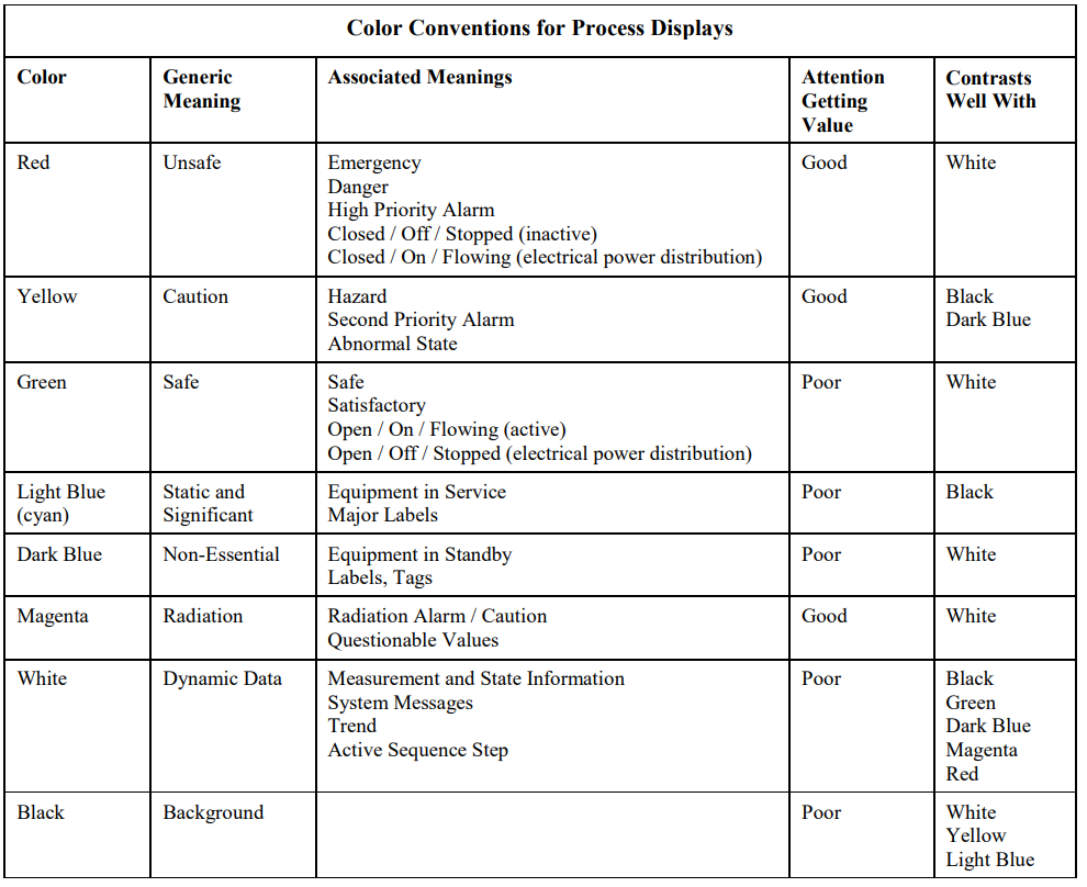
The color conventions given in Table shall be used for process displays.
Guidance: Color identified in the last column as “Contrasts Well With” are recommendations, not requirements. However, color combinations should be carefully selected to ensure good contrast (e.g., do not use red characters on a green background).
When using the colors red and green in a HMI, clarify the meaning on the display by providing clarifying text next to the indicator. In any given HMI system, the use of colors shall be consistent throughout all displays.
Process Control Graphics Display
systems and components, a review shall be conducted during the design process for proper application of color and shape conventions from a human factors perspective.
Guidance: The number of colors used for coding should be kept to the minimum needed for providing sufficient information (usually no more than eight colors). Decorative use of color should be eliminated.
Highly saturated colors should be used for coding to provide good contrast from each other and their backgrounds.
Gradual changes in color intensity should not be used to indicate relative values of variables.
Flashing or audible indications should be included when display items require immediate operator attention, such as alarms.